“I Made This…”: Works of Black Artists and Artisans in America
Brief
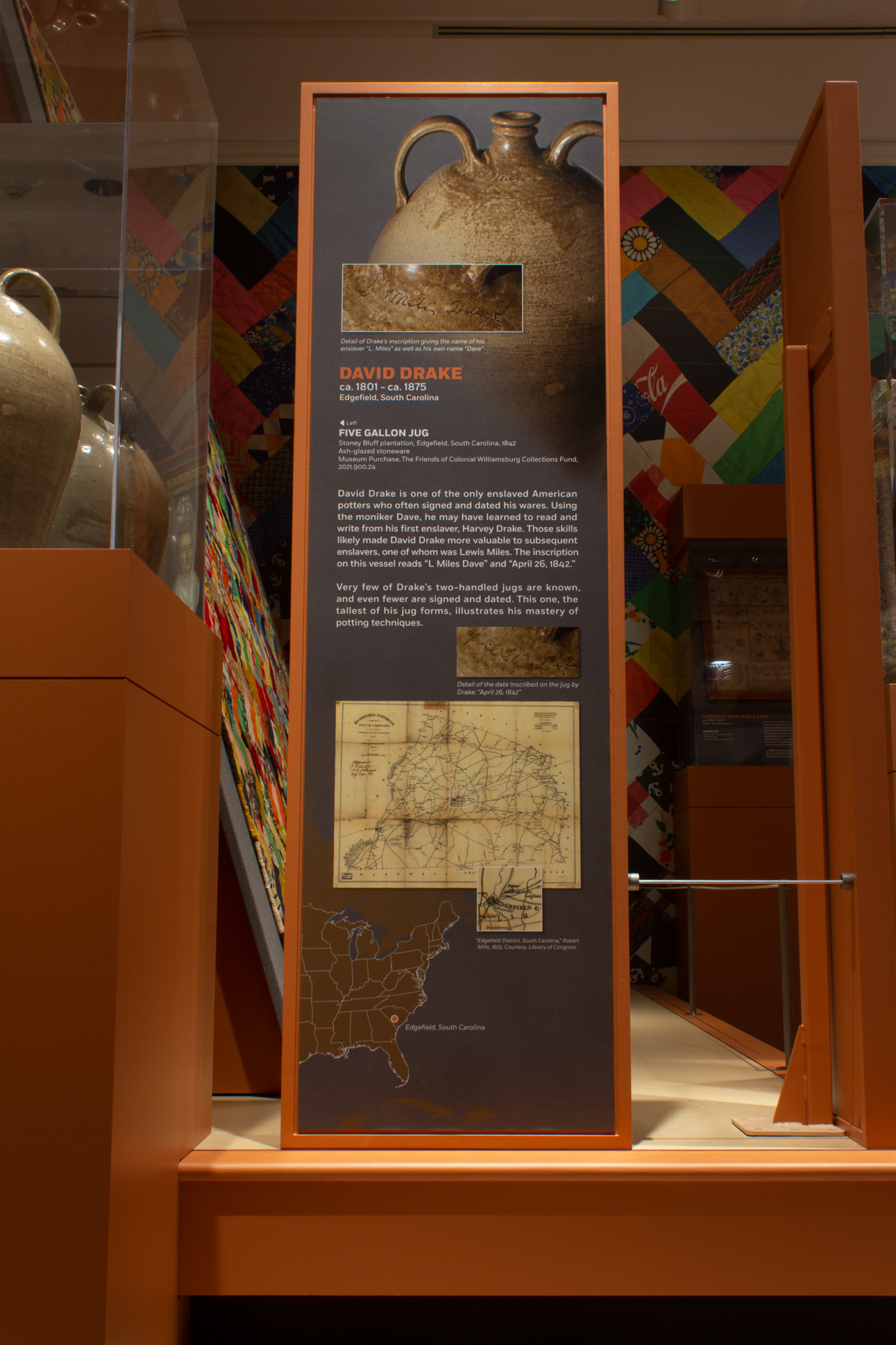
In early 2021 I began work my first exhibition leading the graphic design. The new exhibition was titled “I Made This…”: Works of Black American Artists and Artisans. The exhibition title is derived from a common inscription by enslaved potter David Drake. Drake would often inscribe the date, his signature and a statement such as “I made this jug” in his pottery.
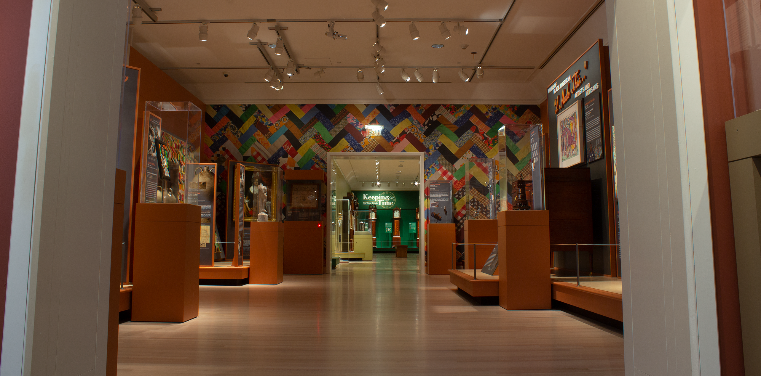
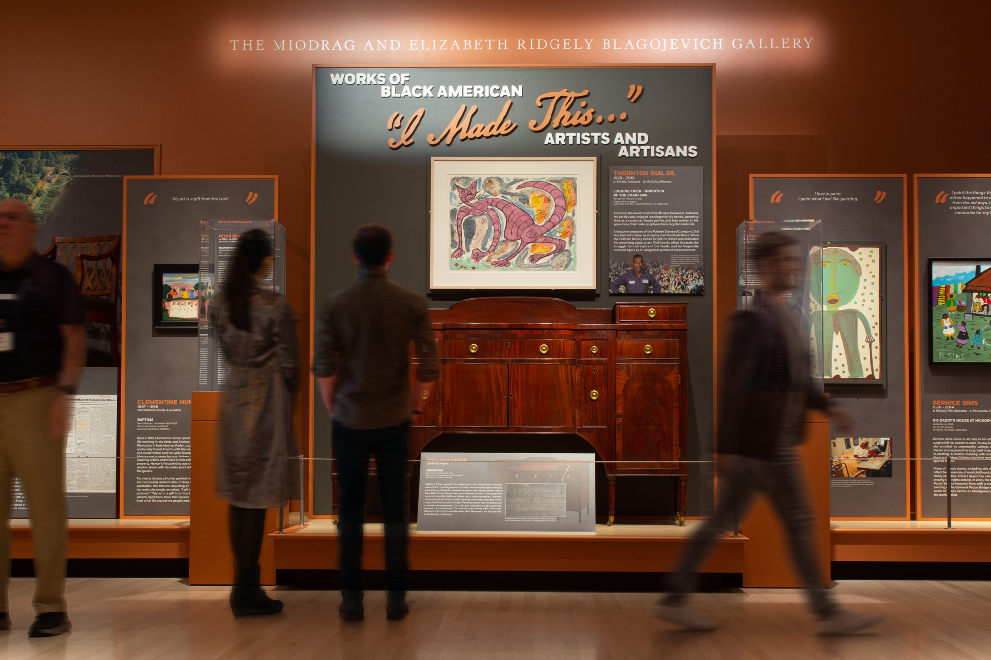
The design brief was to create an exhibition that was bolder and more contemporary than many other exhibitions in the museum. The exhibition included nearly 30 objects and was to be located in Miodrag and Elizabeth Ridgely Blagojevich Gallery of the DeWitt Wallace Decorative Arts Museum. After receiving the brief, I got to work on the logo, which would define the exhibition brand going forward.
Logo
Over the coming months I created numerous logo iterations, ranging from conceptual and avant-garde to refined and minimal. Throughout the process, I continually returned to directions from Director of Museum Design, Richard Hadley, to make the exhibition respectful, uplifting, and bold. Together, we narrowed the logo down to a direction which recalled but did not imitate Drake’s inscriptions. This bespoke word mark was placed in conjunction with a strong sans-serif typeface, Fort by MCKL. The logo continued to be refined until early September 2022 though conversations with Senior Exhibits Graphic Designer Valerie Eppolito and Senior Vice President, Education and Historic Resources and The Carlisle H. Humelsine Chief Curator Ron Hurst.
The logo would go on to be CNC machine cut in PVC for the title wall. The production was completed by contractor, while all finishing, priming, painting and installation was completed in house.
Color
The red-orange color of the gallery would come to be a defining characteristic of the exhibition brand. I used the color in my graphics to call out important information, most crucially, the names of the artists, which took on unusual prominence in the story of this exhibition. Everywhere else, I chose a muted palette to allow the white body copy and the artworks themselves to stand proud. The gray backgrounds of the graphics feature a subtle grain texture, created in photoshop, which complements the heavy use of pre-digital photographs.
There were a myriad of challenges in managing the color palette of this exhibition. Biggest amongst them, being that the title wall was too large to be covered in print graphic like the other panels. This meant that the surface would need to be painted. All the other gray backgrounds in the graphics would need to match this gray paint as closely as possible to create a cohesive look. Throughout the development of the graphics I frequently printed, laminated and installed color swatches to compare to painted samples under gallery lighting. Then, based on this comparison I would adjust the digital file before printing again. That was then repeated for each of the three different materials. This process was necessary to make sure the palette remained consistent across the exhibition.
Typography
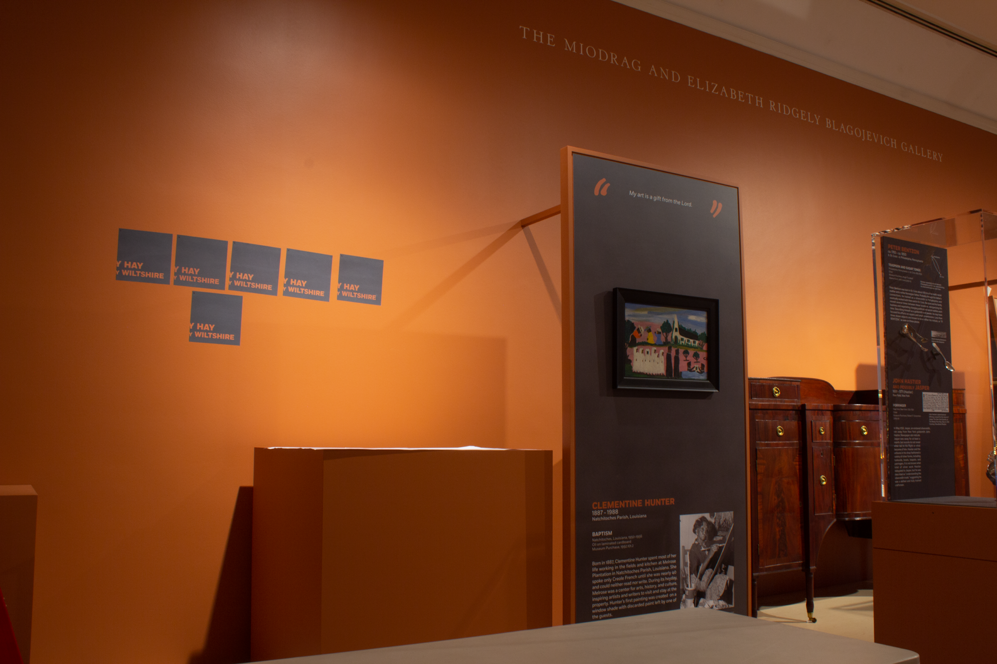
Typography is essential to making an exhibition legible and engaging to the public. From the beginning of the process, I placed high value on accessibility and consistency in my graphics. Early on I created mockup and prototype graphics to test type size, style, color and layout across a range of uses. This prototyping process allowed me to build a tightly defined style guide for 4 different graphic sizes, improving efficiency and consistency when it came time to create the graphics. “I Made This…” is a highly “maker” focused exhibition, so Hurst and Hadley decided to make the maker’s name and life dates be on top of information hierarchy. The artwork name and tombstone came next, followed by the body copy, with the image captions and credit lines coming lowest on the hierarchy. Where applicable, we added quotes by the makers and called attention to them using the signature orange quotation marks from the exhibition logo.
Spatial Problem Solving
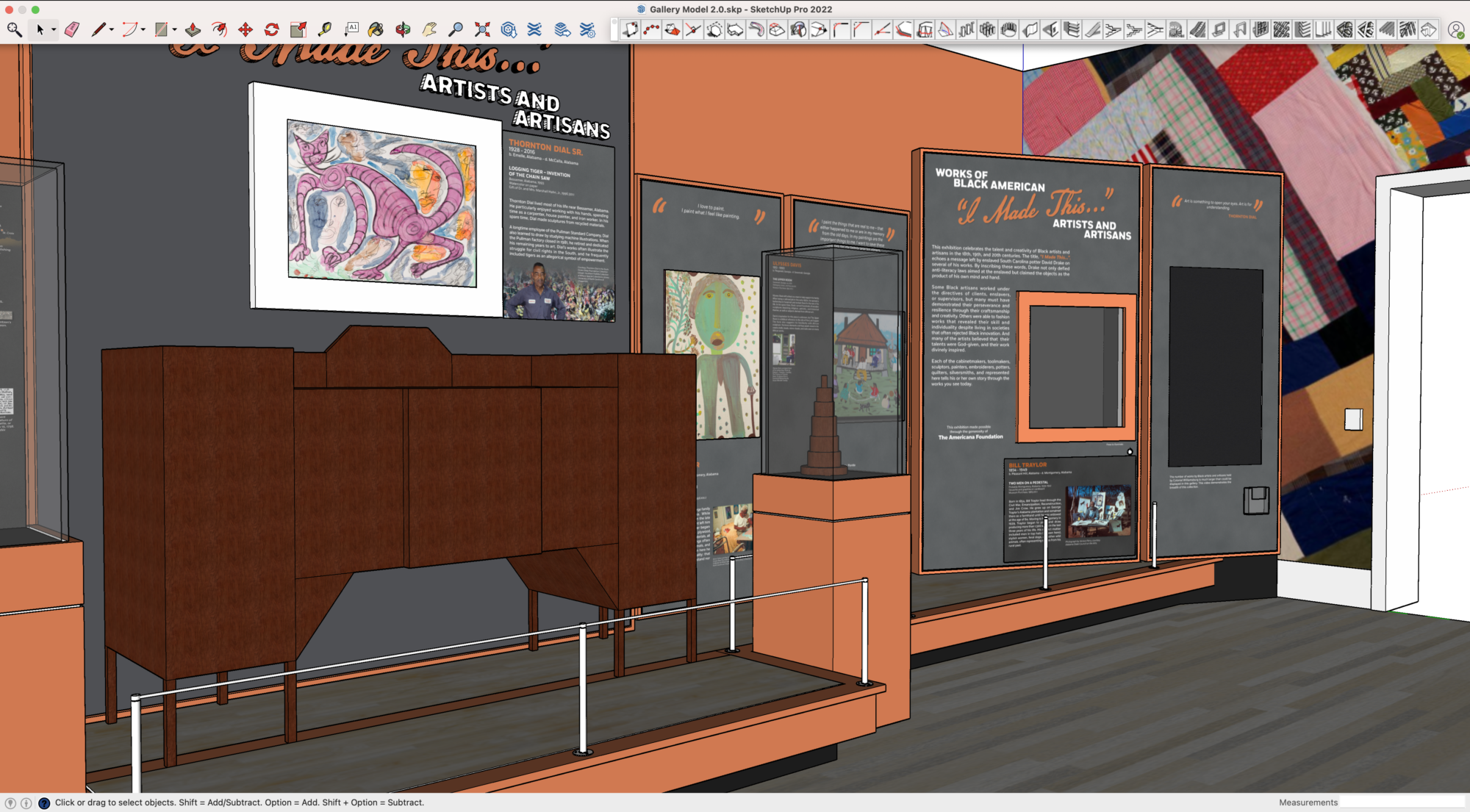
Early in the exhibition design process, Exhibition Technician Sam Baltezore created a 1″:1′ scale model of the exhibition space. As I worked on the exhibition logo, color palette and label hierarchy, these elements were created at scale and added to the model. This step helped sell the exhibition direction to senior leadership. Additionally, I developed a 3D computer model of the exhibition in SketchUp Pro to assist in the design process. To create the model I surveyed the gallery space, striving for a granular level of detail to more accurately understand the space. This model ended up being crucial in the process. The model allowed the exhibition team and myself to predict and preemptively solve design issues, such as problems with lighting and viewing angles. All graphics were implemented into the 3D model so that they could be seen in the space before the printing process began. The 3D model also allowed me to precisely calculate the amount of material needed, and the best nesting technique for the two large mural graphics. The 3D model proved so useful that after completion of the exhibition, SketchUp licenses and training are being procured for the rest of the design team.
Team
Curatorial Staff
Ron Hurst, Senior Vice President of Education and Historic Resources and The Carlisle H. Humelsine Chief Curator
Jan Gilliam, Associate Curator and Manager of Exhibitions
Tara Chicirda, Curator of Furniture
Angelika Kuettner, Associate Curator
Kate Rogers, Assistant Curator of Painting, Drawing and Sculpture
Laura Barry, Curator of Painting, Drawing and Sculpture
Preventative Conservation
Petrina Copes, Senior Preventative Conservator
Olivia Bascle, Senior Preventative Conservator
Registrar and Image Acquisition
Jason Copes, Collections Photographer
Erin Lopater, Associate Registrar
Exhibition Designer
Richard Hadley, Director of Museum Design and Operations
Exhibition Design
Benjamin Butler, Associate Exhibits Graphic Designer
Valerie Eppolito, Senior Exhibits Graphic Designer
Jim Armbruster, Manager Museum Design
Jesse Reid, Exhibition Technician
Wayne Carter, Senior Exhibits Cabinetmaker
Sam Baltezore, Exhibition Technician
Cari Rillo, Senior AV Technician and Multimedia Design
Lighting
Jeffery Nash, Lighting Design Consultant
Christian Crabbs, AV Technician
Press
Upcoming Colonial Williamsburg exhibit showcases Black artists, artisans
Virginia Gazette –
ArtDaily.com – Oct 22, 2022
Colonial Williamsburg Press Release – April 19, 2022
Williamsburg Families –
Colonial Williamsburg lauds Black American artists in October show
Auction Central News – Oct 20, 2022
New Colonial Williamsburg Art Exhibit Highlights The Work Of Black Artists
Peninsula Chronicle – October 24, 2022